Differentiating and Designing a Kanban Program for Individuals
How my Kanban app aims to be different from current major options.

Starting a new project is both exciting and daunting - a world of options lies open, but trying to pursue all of them will lead nowhere.
I felt the same as I started to design the Kanban application, the real question was where to focus and what to strive for?
Early Decisions
I’ve been using Jira most lately, leading me to having it as an initial anchoring point. But the push based workflow and slight barrier of managing multiple boards were what I am trying to overcome.
So I needed more clarity on where this application would diverge.
Decision 1: No task hierarchies, no setting a task to “block” or “depend” on another one. Why?:
- Having relationships between tasks, even optionally, makes everything more complicated and would make a pull centered approach difficult to maintain.
- Instead, the system assumes that the top task in the To-Do column is always actionable.
- This also encourages users to spend a bit more time upfront to consider flow and dependencies, without over-engineering.
Decision 2: The program will have minimal to no metrics/reporting; an example of potentially acceptable reporting would be Cycle Time. Why?:
- The data that could be collected would lack the context of the users’ actual situation, skewing how they approach improving away from being fully grounded in their reality.
- Because datapoints are abstractions, it’s better to clearly communicate their limits. This empowers the user to reflect on the broader situation when making decisions.
- Extensive reporting could potentially lead to them aiming for the metric first.
- Reports can become distractions and reduce time spent on actual progress. Trade-offs: It is possible that some users would miss reports/metrics, but I think the cost of distractions outweigh the benefits. (Though I’m open to hearing counterpoints!)
Decision 3: While the main goal is to improve internal transparency for the user, there will be simple options to share current work with others - while still respecting confidentiality. Why, and how?:
- Even when working alone collaboration is part of being human. I want to reproduce the birds-eye view that a physical Kanban Board naturally provides: just enough to signal capacity, without over-sharing.
- Include several options and customizations (post v.1), such as: project names and in-progress counts, a full list of current task names, etc. An option to include To-Do count(s) could be especially valuable to help others understand your full workload.
Decision 4: Include a simple (optional) weekly retrospective, and display their responses until the next review. Why?: This encourages more reflection and a growth mindset, helping users think holistically about barriers, successes, and how to adapt.
That gives an idea of some of the things I’ve been thinking about on how to Kanban better for individuals juggling multiple projects. These, and many more, are tracked in a decision log file on my local git - but which I’ll be uploading to GitLab in the next 24 hours or so. Update: Find the repository here: https://gitlab.com/initialsandastringofnumbers/kantan-kanban
Sketching Some Outlines
These early choices set what this Kanban app isn’t as much as what it is. With a foundation laid, I could start envisioning what the interface would actually look like.
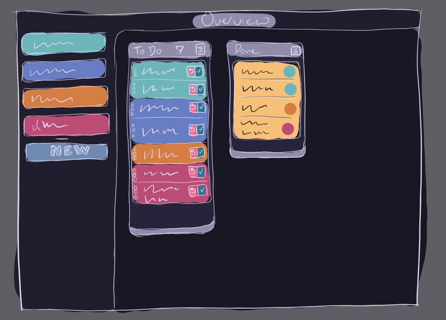
This is the main Overview view, where the consolidated list of In Progress items is shown, along with some of your recently completed tasks.
 You’ll notice that the bar on the left has color-coded buttons for each board, which is reflected in the To Do list, letting you see at a glance what project each task is building towards.
I’m playing around with how to quickly mark something complete, or bump it back into the queue. Because sometimes after starting on a job you realize that you missed a prerequisite, or you’re just not ready to start at that time. But two buttons might be overly busy.
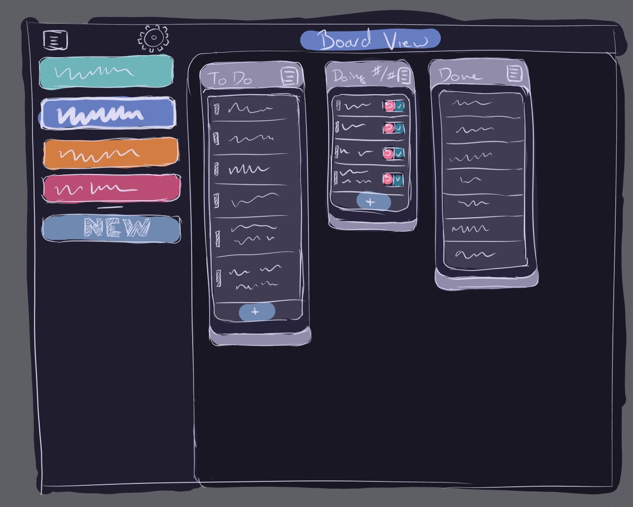
Finally, this would be the initial Board View for a specific project. Here I tried keep it clear what project your looking at by using the color as a backdrop for the board name (the image has “Board View” but it would be the name), while at the same time highlighting the button on the side-bar.

I have a question for you, dear reader - would it be helpful if I shared sketches of how tasks move through the system? I would love to hear your thoughts before diving in too deeply on that!
Takeaways
Tracking decisions and why you made them, along with trade-offs and future implications, builds a strong foundation for any project.
Next Time
I’m deep in QML now, and have learned that it’s quite a bit different from “classic” Qt. So I’ve taken a step back to dig more into the basics, with several Qt Academy lessons. I’ll cover some of what I’ve learned there, and how it’s impacting my approach.
Photo Credits: Photo by Jonathan Göhner on Unsplash